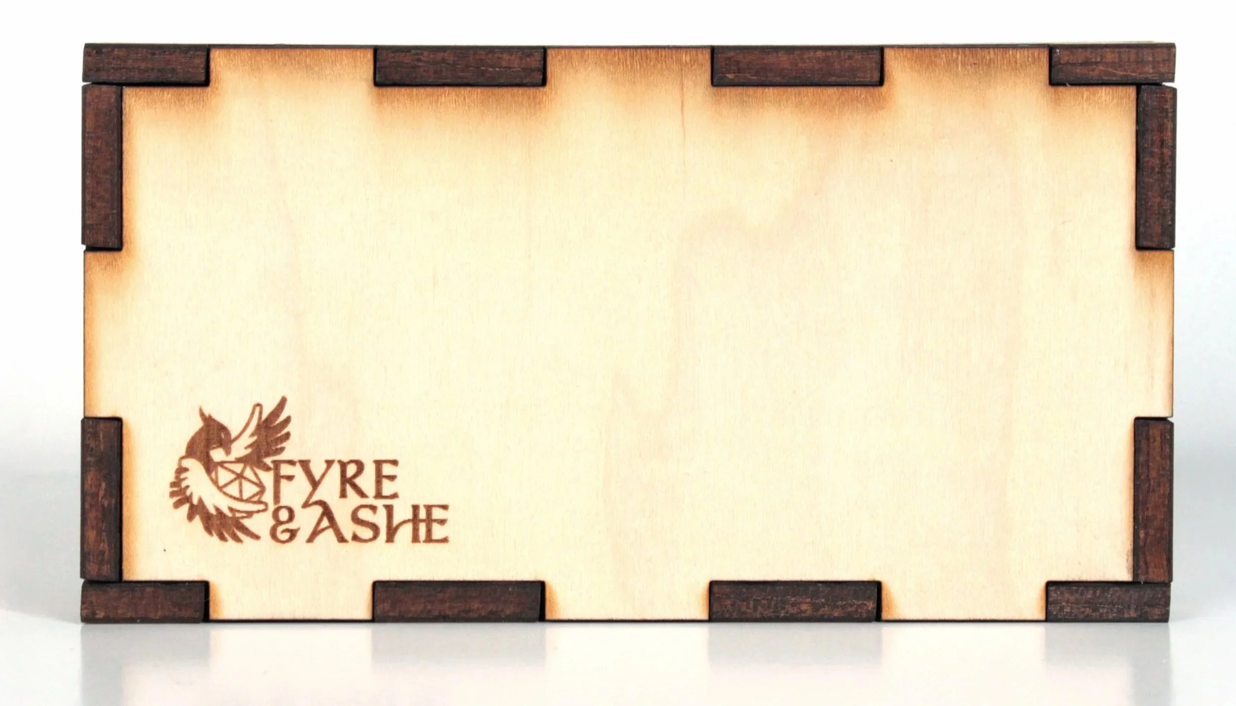
Fyre & Ashe came to me for a brand refresh. Their DIY logo had served them well but was starting to hold them back. The challenge? Keep the same colors, font, and overall feel — but give it a professional upgrade.
I simplified the original wings, added a phoenix to reflect their name, and refined the typography with custom flourishes for a more polished look. Since the logo needed to be scalable and wood-burn friendly, I kept details clean and bold for single-color use